Update 2012-01-29: latest about infographics see also: Karen Dietz – storied infographics: why do they fail?
From September 23, 2010 to September 23, 2011, 89 percent of infographic mentions were in English and 91 percent of online mentions occurred on microblogs.
Unfortunately, infographics are often judged by their beauty, not quality. Sometimes, instead of following the more effective KISS (keep it simple stupid) principle, a good idea is made into a convoluted waste of ink.
Article source – On lies, infographics, and unverified numbers
German version of this article you can find here: Lügen, Infographics und nicht verifizierte Daten.
Statistics are like cosmetic surgery, the final result is great, but what the procedure concealed is key. Before I explain what this means for your work, sign up with your email and join our over 5,000 readers:
High data-ink ratio – too high
I recently found a tweet with a great headline, 10 amazing e-commerce infographics. Let me explain why, based on the graphic below, the contents left something to be desired.

First, circles are difficult for people to grasp, because most are unable to gauge the differences. When compared to 9 and 14 percent, 3 and 5 percent are smaller than they should be, and three 5 percent circles will not even fill the blue 14 percent circle under West.
Using a format that makes it hard for viewers to get the message is one thing, but making the final product inaccurate simply misinforms your audience, doing both you and your audience a disservice when people wonder, can I trust the results when you fudged the data?
Second, the idea that men think about sex every 7 seconds, like the claim that we only use 10 percent of our brains, is often repeated but rarely sourced. Worse, the number does not bear up under scrutiny of the original data, such as for the above infographic:
- The 10 amazing e.commerce infographics blog post appeared on July 25, 2011, and got tweeted on August 25, 2011 (when I saw it) – see bit.ly statistics.
- Econsultancy tells us it came from Pod1 – March 28, 2011.
- Pod1 tells us it is from MyCouponCodes.com, without linking to the original blog entry, Online Shopping Around The World: How We Spend Our Money Online [Infographic] – March 15, 2011.
- MyCouponCodes.com paid Richard Scott Design to create this infographic – March 16, 2011.
- MyCouponCodes.com gives a link to the original source data from Nielsen’s Global Online Shopping Report – download report (pdf) – June 29, 2010.
Now things get really interesting
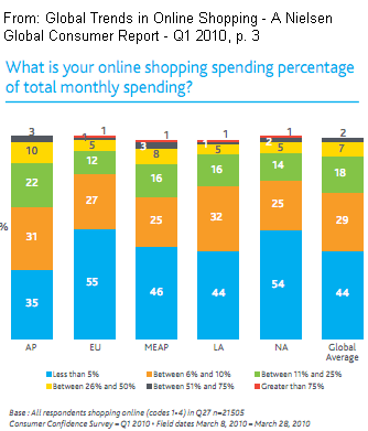 After a ten-minute search, we have arrived at the original data source, a Nielsen report. Its graphic on page 3 was subsequently used by Richard Scott Design to produce an infographic.
The above circles suggest that 51 percent of West survey respondents spend less than 5 percent of their monthly income online. Based on the chart, adding EU – Europe (55), LA – Latin America (44), and NA – North America (54) gives us a total of 153, divided by 3 to arrive at 51 percent. So the West includes Chavez’ Venezuela and Castro’s Cuba?
As well as failing to provide a URL to the original source, it seems the infographic misrepresents the Nielsen study’s data.
Nielsen could learn a few things too: a classically simple, colored bar graph would better deliver the information than the current graphic. If you prefer, a table listing the ranges on the left and regions across the top from left to right would also work nicely.
Finally, even the original data source may lead a reader to question some things. For instance, how accurate were respondents in representing their online shopping habits? Does the respondent’s income level (e.g., student) affect responses? Unfortunately, Nielsen’s report does not say.
Cut to the chase
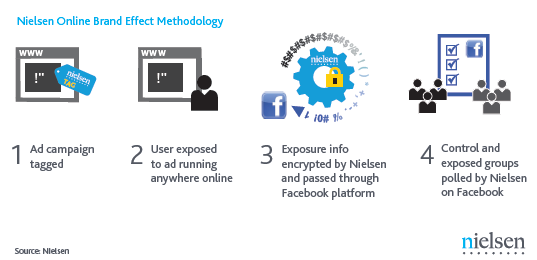
This infographic (I call them graphics) clearly and succinctly tells us how Nielsen collected data using Facebook for another study.
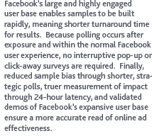 Nearby, the report explains their methodology (see right). Put bluntly, authors admit that while they have reduced possible biases, their data are still not representative of the US population. Of course, the busy professional and/or CEO is unlikely to volunteer for doing an online Facebook survey, are they?
So, are these data useless? Surely not, but all we can say is that they give us a feel for Facebook users. But we also know that sex, lies and statistics all help sell – anything. Accordingly, Nielsen chooses to generalize from these data in its press release.
Don’t forget – benchmark your blog – measure for impact – use My.ComMetrics.com and improve your blog’s performance
Bottom line – take-aways
1. Do not misrepresent data: Sometimes, designers use visualization to exaggerate an effect, which means data get misrepresented… Like stories of men thinking about sex every 7 seconds. This number gets people’s attention, but it does not withstand any scrutiny.
2. Do not use infographics unless they add value: For instance, taking a graph from one study to make another infographic is justified only if it helps further explain the issues investigated. If this does not help you and I to better understand things, why confuse matters?
3. Be ethical and tell readers where data come from: Social media monitoring reports must include information that allows readers to understand where data come from and what methodology was used (e.g., self-selected sample of online survey respondents). Limitations, such as data that is non-representative of the population must be clearly spelled out.
4. Check and re-check the original source: Next time, carefully check the information before re-tweeting it and give the originator credit where credit is due. What are considered marvelous infographics are those that try measuring online behavior in square feet.
Tip: Search for more information regarding graphics and infographics on ComMetrics
Of course, you can ignore the above four suggestions, but you do so at your own peril (as Twitter Only Converts A Small Percentage Of Users Into Shoppers, But They Spend shows). Check the facts and you learn that 1 million visitors nets you one buyer who spends $24 more than those arriving via search – Google.
Please provide a link in your comment below!
I look forward to your comments.
TL:DR
@ComMetrics says: 4 ways to check: Can we trust this infographic? | Tweet This
Pingback: Urs E. Gattiker
Pingback: Naijand Inc
Pingback: World Economic Forum
Pingback: Urs E. Gattiker
Pingback: Urs E. Gattiker
Pingback: Beth Kanter
Pingback: Osocio
Pingback: Alan W. Silberberg
Pingback: ✜ Stephen Ransom
Pingback: Joe Fahs
Pingback: Betty Allen
Pingback: Alex Hall
Pingback: Tom - BDC Manager
Pingback: Tom - BDC Manager
Pingback: Urs E. Gattiker
Pingback: Neus Lorenzo
Pingback: Vladimir Kukharenko
Pingback: Hugh McCabe
Pingback: Infographic
Pingback: Info-Graphics
Pingback: Cynthia Wetzel
Pingback: Info-Graphics