Infographics are increasingly popular but more often than not it is a matter of lies, infographics, and unverified numbers. However, even if numbers can be verified and the infographic tells you more than 1,000 words, you need a good story to go with it.
 As this guest post by Karen Dietz explains, one method to improve the impact of your infographic is telling a story with it.
Why this, why now?
This blog post came from discussions on Google+ between technology and nonprofit colleagues about which infographics really work, and which don’t. Since I work in business storytelling and organizational narrative, my comments tended to point out if an infographic actually told a story, or contained story devices to make the piece memorable, understandable, and more effective. People wanted to know more and kept asking for a blog post.
Even if you are not a creator of infographics, hopefully the material below will give you ideas for displaying visual information in more compelling ways. I’m not a formally trained graphic designer, but have had to learn many design principles over the years. I eagerly read Edward Tufte’s work years ago. Alas, I do not create the type of gorgeous infographics so popular today. Think of me more as an outside reviewer cross-pollinating different fields. I take my lessons from the infographics world back to my business colleagues and clients so we can improve our own visual storytelling materials.
Why bother?
Why would you want to incorporate story elements into your infographic? Or why would you want to have your infographic actually tell a story? Because our brains are hard-wired for stories. It is how we make sense of data and how we make sense of the world. When we are engaged with a story our brains release oxytocin, dopamine, and seratonin, stimulating feelings of reward and connection. Infographics can spark the same. When information is conveyed visually and also employs story elements, viewers will more easily grasp the meaning of the data and be able to act on it. And they will share it.
As Nathan Yau says in the chapter entitled Telling stories with Data in his book Visualize This; The FlowingData Guide to Design, Visualization, and Statistics (2011), “It’s not just a bucket of numbers. There are stories in that bucket. There’s meaning, truth, and beauty” (page 2). He goes on to say, “Sometimes you’re not looking for analytical insight. Rather, sometimes you can tell the story from an emotional point of view that encourages viewers to reflect on the data.
Not all movies have to be documentaries, and not all visualization has to be traditional charts and graphs” (page 5).
From time to time, infographics are meant to feed urgency and stir people to action. Sometimes in building an infographic, all that needs to be done is make sense of complex data. Sometimes a story needs to be told to make the data more meaningful and inspire action. It all depends on what work you want the infographic to do. To continue:
- First, we will look at the difference between storied and non-storied infographics.
- Second, we will delve into story elements that can be used in infographics.
- Third, we will examine the strategic thinking that needs to go into figuring out whether to use story elements or not. And I will share some of my favorite storied infographics.
- Fourth, we will wrap it up.
1. What is the difference between storied and non-storied infographics?
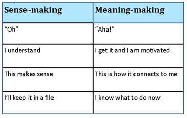
Visual displays of data are sense-making tools. It is all about making sense of complex data so it is easily understandable. The typical reaction of the reader is, “Oh, I get it.” Storied infographics go a step beyond sense-making to meaning-making. The viewer says, “Aha! I get it, this is how it relates to me, and I now know how to take action.”
What we also need to know is what neuroscience is teaching us about the brain and how it processes information. In simplistic terms, it is commonly known that the left brain is linear, logical, skeptical, processes numbers and facts. It is also emotionally neutral (this is important), often seeking more information. If you’ve ever been in a room of engineers doing over data, you know a lot of debate about the numbers goes on, and it is easy to get stuck there. The right brain however, is relational, imaginative, fills gaps where information is missing, and is emotionally engaged. Being emotionally neutral or emotionally engaged is hugely significant. It has been said that we make decisions emotionally (in a nanosecond) and then justify our decisions with logical reasons. So if you want someone to take action on the data that’s provided, incorporate meaning-making story elements to enroll them.
2. What are the story elements to include?
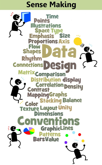
Adding story elements into an infographic will have it connect more with your readers, make it memorable, more shareable, and potentially go viral. The first graphic lists commonly used sense-making tools (I’m sure there are others to add).
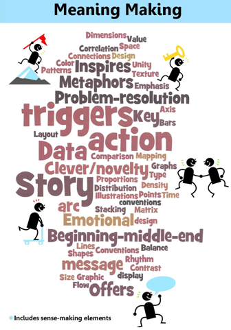
The second graphic adds the available story elements that could be added to an infographic.
Here’s more on each story element, with examples. Story elements include metaphors, which I am sure you are familiar with. I often find these in infographics, but not all the time. When they are used, they make the data so much easier to digest. I now have a framework to relate to, a framework for the data so I can understand it more easily. Below are two examples that effectively use metaphors to frame the material.
Compare this to the infographic on The Size of the Mobile Market that does not use a metaphor. Not all brains are alike, but for me, framing these data with a metaphor would have made this a lot simpler to grasp. Stories often have characters and many infographics include representations / profiles of people to help draw us in, make their point, or relate to the data. People connect to people (or dogs, or cats…) more than numbers. Here are two good examples:
So far, so good. Let’s continue. As you well know, novelty is also key. Without novelty, there is no story. It builds interest, makes us smile, and pings our brain to pay attention. We all know that color, typeface, and design create contrast and catch the eye. Finding novel ways to display data is fun and catches the reader. In a world where we are bombarded with stimuli that we mostly tune out, our brain hunts for – and delights in – novelty. When we find it, we engage. As I explore the best of the best infographics, I find lots of novelty. It’s fun to see how creative designers are. Here’s a great example that includes both novelty and contrast between the computer geek and action hero:
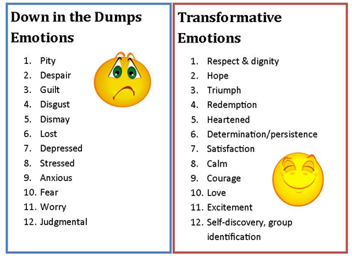
Emotional triggers are visual and data display devices that evoke emotion. Think of how we feel when we see data about people going hungry – usually not so good. But here is the important point about evoking emotions: you never ever want to leave someone feeling bad. There always needs to be a way to resolve the emotion. This happens in two ways: through building the infographic around a story arc, or by presenting a problem and its resolution. A story arc is not just having a beginning, middle and end to your visual story. It is about moving viewers from dismay / despair to heartened / hope.
Story triggers lead to the ultimate infographic experience. Stories work so well because they remind people of their own experiences and spark the reliving of stories within their own minds. Infographic designers can trigger stories within the viewer’s mind by adding words or images that trigger personal memories. Story triggers create strong connections to your data and help people make the material meaningful. Here is an example using birthdays:
All great content (stories, blog posts, ebooks, etc.) present a problem / challenge and its resolution. This is not necessarily offering a solution (i.e. “Do this.”), but by offering ways to shift / change / act on an issue so it is resolved. So many infographics present a problem but no resolution. We anticipate an ending but there is none. It abruptly ends and readers are left hanging without a way to easily finish the story. The reader has to do all the work to finish interpreting the data in their own minds, making it meaningful and applicable to their own lives. Plus, without a resolution, the data does not stick. The infographic that took so much time and labor to create is quickly forgotten or ignored. Here are two examples of simplistic infographics without a resolution:
You have read up to here, get the next post sooner, like 5,000+ subscribers do via email, subscribe here:[subscribe2]
Okay, let’s talk about beginnings-middles-ends, also known as sotry arcs. The easiest infographic visual layout to use for this element is the popular long vertical form. Works for me. I know where to begin and where to end, and I anticipate lots of good data to digest in the middle with transitions that help move the story along. Some data is displayed in such a way that we get it by simply viewing it, so beginnings, middles and ends don’t apply. Like a subway map. But if you want more information on creating story arcs and effective transitions, check out Nancy Duarte‘s book Resonate: Present Visual Stories that Transform Audiences. It has great diagrams and structures and her thoughts can easily be applied to infographic designs when needed.
Now we are getting to the end and the question remains, what is the key message to convey with any infographic? I am sure this is familiar territory. And of course, this has to be figured out before figuring out how to display the data.
- What insight do you want people to gain?
- How do you want them to feel?
- What do you want them to do?
- What is the point of the infographic?
Here is an okay infographic without a key message that is relegated to ‘bland land’:
As I have said before, by the time you reach the end of the infographic, there is the opportunity to inspire people to action. Here are a couple of my favorite storied infographics that include all the story elements mentioned above:
3. How to determine if an infographic should tell a story
Consider these questions:
- What is the purpose in putting the infographic together?
- Who are you trying to reach?
- What personas or archetypes do they reflect? Understanding this helps select graphic design elements and metaphors.
- Are there characters that could be added that reflect the personas/archetypes to make the data more meaningful to readers?
- What emotions do you want viewers to feel?
- Where do you want them to start?
- How do you want them to move through the material?
- What is the key message?
- What do you want readers to do?
4. I think this all comes down to one of my favorite quotes:
“The role of the storyteller is to ‘Comfort the afflicted and afflict the comforted’.”. This is from professional storyteller Elizabeth Ellis. I can see how infographics can do the same. I bet you are already using some of the story elements above as you design your infographics. Hopefully by collecting them all together in one place they can be more consciously used. If you do decide to add more story elements to your infographics, may you inspire people, go viral, and have more fun!
Tip: Search for more ComMetrics and CyTRAP sources on infographics, statistics, report writing or storying it (click to query).
Disagree? Agree? Sure. Leave a comment!
 About the author: This post was written by guest blogger Karen Dietz, an experienced business story and organizational narrative expert. She writes about the intersection of story, marketing, branding, social media, and technology and curates content on business storytelling at Just Story It. You can find her on Google+ and Twitter @kdietz.
Incorporating story elements into infographics for greater effect, promoting your cause, and shareability | Tweet This
Pingback: Alex Hall
Pingback: Alex Hall
Pingback: Becky Gaylord
Pingback: Tonia Zampieri
Pingback: Karen Dietz
Pingback: Urs E. Gattiker
Pingback: Ralph Scholze
Pingback: JD Lasica
Pingback: JD Lasica
Pingback: The Socialbrite team
Pingback: mike mostransky
Pingback: AN Marketing Group
Pingback: vik sapar