
2009-12-24 – more about A/B testing and measurement: Using great visuals = Failing your customers
How do you know when you have a good website design. Is it what you believe is good design or is it based on your customers’ needs. In case it is the latter, did you use A/B testing or ask your clients for feedback to make sure?
An A/B test shows two versions of a web page that get compared, with version A usually being the existing (control) page and version B being the alternative.
The page that wins based on responses by viewers will be the control page in a follow-up test against yet another alternative.
Here we share some tips and tricks for A/B testing and how you can more effectively leverage this approach for your own needs. Also, keep an eye out for next week’s post, about a case study for applying the concepts below.
1. A/B testing does not guarantee the best solution for design and copy
A/B tests can tell you how the bounce rate of those shown design A compares to design B (i.e. the bounce rate is the percentage of visitors who left your website after having looked at the landing page – 100% bounce rate means someone looked at the first page only and then left your site). The page with the lower bounce rate is then the control page in the follow-up A/B test.
A/B testing works best for projects with an all-important KPI (Key Performance Indicator) that can be measured by counting simple user actions. Examples include registering for a product or making a purchase on an e-commerce site. Unfortunately, things are rarely that simple.
Fallacy: Believing that A/B testing alone will assure that you end up with the best design. In fact, one may just end up with the less-bad one, instead.
2. Permission-based exit surveys suffer from bias
A/B tests often do not give a complete picture. More information can be gained by asking a few questions of groups that look at your design options.
For instance, one can use a permission-based exit survey. Pose three to five questions, such as:
- – What did you like about this design (please explain?
– What did you not like about this design (please explain)?
– What made your navigating of the site more difficult (please explain)?
Fallacy: Believing that people who really know the answers will take the time to respond.
Unfortunately, this non-response bias may lower data validity and, therefore, causes one to make decisions that may be wrong in the long term.
3. Qualitative assessment = talk to clients about design
It seems obvious that, to address the weaknesses mentioned in points 1 and 2, one should speak with clients about the design.
For instance, does your headline tell the average non-geek what the site is really about or are you using too much jargon? An A/B test might suggest that design A is preferred, when in fact it is simply B’s confusing headline that causes people to reject it. If you fix the headline, design B might suddenly be preferred by most users.
If about 30 percent of the test group suggest a change that will improve usability for them, take this FREE advice seriously. It could be that another 20 percent of the sample mention this small change as having improved usability during the next round of tests, without being prompted.
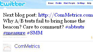 Of course, this is an exercise in checks and balances. To illustrate, I tweeted about possible titles for this blog post (see image at right). Unfortunately, what I felt was a great headline for stirring interest and getting more traffic failed the acid test. I got several messages suggesting that the title may not be appreciated by vegetarians…
Fallacy: Believing that talking to customers or other knowledgeable resources takes less time and money than A/B testing. Interviewing people and evaluating notes/data carefully takes time. Sometimes reaching people by phone can be difficult, further extending the time period needed to move from draft to final design. Be patient!
More resources about A/B testing
- Jason – Easy statistics for AdWords A/B testing, and hamsters. Note: the suggested Pearson’s chi-square works best for 2 x 2 tests. If you test three or more designs use log-linear analysis instead; an A/B test is not appropriate.
Rebekah Paul – How to test landing pages
Bobby Hewett – A/B and multivariate testing in plain English. Each test type depends on the needs of the business and the goals of the page…
US Federal Government – Usability gov – please don’t make me think
Deni Kasrel – The most overlooked step to website success
Cindy King – How to connect globally with social media. It is a start, but still amazingly narrow and bloggers make assumptions to explain differences.
Bottom line
A/B testing is important and works best for clearly defined problems and tasks. However, the Web 2.0 environment requires that such tests, which use simple metrics, be supplemented by qualitative data. The latter provides the all-important insight needed to adequately respond to clients’ usability issues.
Take-aways
There are some crucial things to remember when applying A/B testing in conjunction with qualitative assessment.
- 1. 30 percent rule. If that many interviewed clients or experts want something, do it. Every 30 percent you satisfy with a key element that is integrated into your design will increase relevant traffic – guaranteed.
2. Designers do not automatically know what clients crave. They have an agenda, if not a preference, but one needs to make sure that YOUR clients are happy with what the designer believes looks best.
3. The US is not the world – LOL (laughing out loud). We tend to forget that we need to provide good usability to people from vastly different backgrounds and cultures. Hence, make sure that your usability and/or A/B testing includes customers representing your key markets based on country, age group, education level, occupation and gender.
Please, leave a comment! We love to hear your thoughts: how do you use A/B testing, and when does it fail for you? Here is a chance for anyone with first-hand knowledge (this means you!) to share your insights.
Special thanks to Deni Kasrel, who got me to write this post.
P.S. – You can get updates on this blog through Twitter, by following @ComMetrics. You can also get a free subscription by RSS:
Pingback: Apel Mjausson
Pingback: Jason Cohen
Pingback: Seth Simonds
Pingback: Smashing Magazine
Pingback: Stoyan Shishev
Pingback: Stoyan Shishev
Pingback: Vincent Nguyen
Pingback: Pedro Bachiega
Pingback: Gee Ranasinha
Pingback: Jane Oxley
Pingback: Alice L
Pingback: irfaan
Pingback: Kurren
Pingback: Angie McKaig
Pingback: John Roy
Pingback: Barbara Nowacka
Pingback: CodeMyDesigns.com
Pingback: Sherry Holub
Pingback: IS5103 Web Tech
Pingback: ComMetrics weekly review: Hollyoaks excels as Google stumbles » social media monitoring, social media measurement, marketing metrics, best metrics, best practice, cost-benefit analysis, benchmark social media, right blog metrics, reputation, brand manage
Pingback: 4 strategies to leverage usability tests » best practice, checklist, social media monitoring, social media marketing, benchmark testing, Twitter monitoring, Facebook strategy, customer engagement » ComMetrics University social media seminar (Weiterbildu
Pingback: Measuring social media to boost ROI » social media monitoring, social media measurement, marketing metrics, ROI, best metrics, best practice, cost-benefit analysis, benchmark social media, right blog metrics, reputation, brand management » Helping you b