How do you make it look good?
How do we make it buzz-worthy so people pass it along the moment they see it?
By the way, do what 5,000 other subscribers have done, sign up for our FREE blog newsletter!

This blog post provides some answers to the above questions. 10 mistakes bad infographics make and 10 things great infographics always share.
Nice infographics that are useful, informative and more – examples:
Always remember the keep it simple, stupid! (KISS) principle. This is about more than just making things beautiful – unless your picture is really worth a thousand words, it may confuse more than it clarifies. Infographics do not fail, that their creators do: usable and useful infographics are fantastic for link building and communication.
1. Use your network smartly
Recently I got an email with the following content (name changed to preserve privacy):
“From: Shelli Miller
Subject: ComMetrics
Date: July 8, 2013 11:12:02 AM GMT+02:00
To: Info@CyTRAP.euHello Urs,
I’m Shelli, an avid reader of your blog. I must say you’ve got a ton of great contents on your blog and have built a great readership out of this.
Since I read your blog and have a sense of what topics you cover, I think you’d be interested in sharing my infographic “The Data Mining Business and How You’re Free When You Die” with your readers. Here’s the link: http://www.mastersinit.org/digital-afterlife/.
Please feel free to let me know if anything I can do for you. Thank you for your consideration.Regards,
Shelli Miller”
Problem 1: I am not sure how this infographic relates to the topics we publish. When sharing an infographic, ensure the recipient is interested in the topic beforehand.
2. Size it correctly
A typical image that is about 300 pixels wide is too small to be pinned on Pinterest, but someone still might use it in a blog post. However, anything wider than 554 pixels will not fit most blogs and Pinterest will shrink it.
Unfortunately, shrinking an infographic makes things less legible. Shrinking 799 pixels in width to 67 percent still makes the infographic 533 pixels wide.
Problem 2: Ensure your infographic is no wider than 520 pixels, making blog embedding easy and html code to resize it unnecessary.
3. Make it user-friendly
When a graphic is too large, shrinking can result in making things too small to read without a magnifying glass.
Problem 3: If an infographic has to be shrunk too far references and numbers become illegible. Thus it fails the usability test.
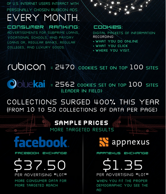
4. Make it visually appealing
The above example is neither easy to read (e.g., white text on black background) nor appealing. Using different font colors does not help either.
Problem 4: Too much ink drowns the infographic’s information. Less is more where color is concerned.
5. Adding value
Remember, it’s not just about the infographic. You still need to capture people’s attention to the extent that they understand your infographic. Please consider:
- adding some original thought,
- conveying your message more clearly by using some tables, and
- adding some text to make the infographic self-explanatory.
Problem 5: Do not just send the infographic around or post it on your blog, explain before and after why it matters, what insights it provides and how it helps the reader better understand things.
6. Give context!
If yours is not the primary data, ALWAYS refer to the original source – not another blog that might link to the original source. Do the work and provide the link to the original yourself!
The Internet is global and explaining that 10 out of 20 people shop at Walmart and purchase Coca-Cola once a week is interesting, but if the data comes from US consumers, it cannot be applied to Italians, who have no Walmart, and may buy San Pellegrino instead.
Problem 6: People put together infographics with bits and pieces from many sources. KISS means more than five data sources makes getting the message fast too difficult.
7. Add and embed code to let others share
Let people know that it is okay to share your infographic, and provide the code to make re-posting it easy. The code should be set up to show the infographic directly from your server, with a link beneath attributing it to you and your original post.
Here is an example:
<center><blockquote><textarea COLS=50 ROWS=10>
<p style=”padding-left: 10px;”><a title=”Infografik: Studie von STRIMgroup und CyTRAP Labs. Berufsausbildung: Wie nutzen Schweizer Schueler Facebook, Google und Firmenblogs bei der Suche nach einer Lehrstelle? http://info.drkpi.ch/?p=5414″ href=”http://info.drkpi.ch/articles/2013-ratgeber-personalsuche-2″ target=”_blank”><img src=”http://www.cytrap.eu/files/infographic/2013/06-02-Resultate-der-Umfrage-wie-suchen-Schweizer-Schueler-eine-Lehrstelle.png” alt=”Infografik: Studie von STRIMgroup und CyTRAP Labs. Berufsausbildung: Wie nutzen Schweizer Schueler Facebook, Google und Firmenblogs bei der Suche nach einer Lehrstelle? http://info.drkpi.ch/?p=5414″ /></p>
</textarea></blockquote></center>
Von: <a title=”Infografik: Studie von STRIMgroup und CyTRAP Labs. Berufsausbildung: Wie nutzen Schweizer Schueler Facebook, Google und Firmenblogs bei der Suche nach einer Lehrstelle? http://info.drkpi.ch/?p=5414″ href=”http://info.drkpi.ch/?p=5414″ target=”_blank”>Infografik von CyTRAP Labs und STRIMgroup: Studie – wie suchen Schweizer Schüler eine Lehrstelle</a>
Putting the above code into the text version of a post will provide a box out of which anyone may copy the code for their own post. The paragraph starting with ‘Von:’ provides the link back to the original post.
Problem 7: Put the Creative Commons license on your infographic to reassure even the most paranoid corporate people that sharing with the help of the code you provided is okay.
8. Brand your link
As the above shows, code should be set up to link back to your server, and a link back to your original post should also be provided (see above).
Problem 8: Not hosting the infographic yourself will not provide the Google search engine optimization (SEO) juice you want.
9. Perform an acid test
I found the graphic below embedded in a story published by the Guardian. While it looks nice, it fails the acid test, because a table listing the answers such as, “40% of people feel paying a bribe can help speed things up,” would probably have done as good a job, if not better, than this graphic.
So, is it just a waste of ink? What do you think? Please tell me in a comment!
Problem 9: Even if you love showing off data, less is more. Unless the figure adds a thousand words worth of information, it fails to add value.
Nice infographics that are useful and informative:
- Infographics – ComMetrics – everything you wanted to know about social media and then some
- Infografiken – CyTRAP – wie man Infografiken nutzen kann
- Xing Social Media Monitoring group – Infographics – useful, helpful FIRSTS
10. Ensure the primary message is received
The infographic mentioned under point 2 supposedly provides information for people preparing for careers in IT or computer science:
“… We are continuously creating contents which are helpful for students who want to make a career in IT or Computer science…”
Problem 10: Can a viewer understand the main thrust of your message at a glance? If the answer is no or maybe, change the infographic.
Get more ComMetrics content on KPIs, benchmarking, infographics, metrics, key drivers, BlogRank (just click the URL to get some very interesting results).
Source: @ComMetrics | Going viral with impactful infographics
Talk to me
Just like an educator, an infographic is ‘cool’ when it presents an important and complex story accurately while looking great.
Most importantly, we must put ourselves in others’ mental shoes in order to understand what they experience when looking at our infographic. Is it appealing, confusing, trustworthy…?
When someone sees your infographic, they must value the idea(s) you communicate with it.
Finally, unless they feel other people might also value it, they are unlikely to pass it on and help make it go viral.
If you are still inclined to create an infographic, be sure to respond to me from your own blog or in the comments about:
- the benefits of your infographic, and
- provide an example of a great infographic (URL).
I look forward to your thoughts and comments below.

The author: This post was written by social media marketing and strategy expert Urs E. Gattiker, who also writes about issues that connect social media with compliance, and thrives on the challenge of measuring how it all affects your bottom line.
His latest book, Social Media Audit: Measure for Impact, appeared in November 2012 (Springer Science Publishers), and he is currently hard at work on the next one.
Connect with CyTRAP BlogRank on Google+
or the author using: Email | Twitter | Google+ | Xing
Comments on this entry are closed.