Why do infographics fail?

by Urs E. Gattiker on 2012/07/09 · 40 comments 10,021 views

in a dos and don'ts,b why data and infographics help,white papers checklists

Data visualization and ROI (return on investement) – Part 1

Can you recognize a great infographic?
Seven sure-fire suggestions for creating superb infographics.
In 2011, 89 percent of all mentions of infographics occurred in English, and 91 percent of online mentions happened on microblogs. A sophisticated infographic can help convey relatively complex information to a far larger audience than simple tables of numbers. This is the first post in a series about infographics, rumour, urban legends and how to make it all work for you.

What is an infographic?

Click on image - Writing-on-Stone Provincial Park - stone carvings1 - image from Termite - the Blog.Visualization has been used to interpret and present data for millennia, as evidenced by the stone carvings at Writing-on-Stone Provincial Park, Alberta, Canada. People have long known that using graphics or other visual aids facilitate comprehension and retention of information provided.

But how can we best present such data for marketing and communication purposes? What makes a great infographic? Some time ago, I noted:
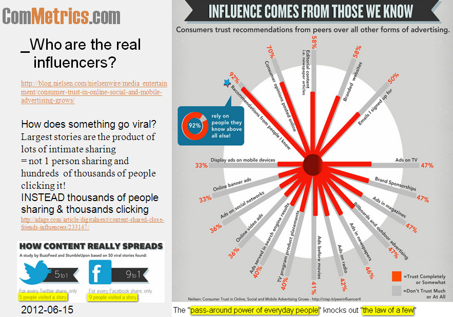
The question is, can viewers see the overall shape of the data more easily and quickly with infographics than any other visual aid? Most infographics fail this acid test.

Type 1: Datagraphic

When presenting data, illustrating it with a graphic helps most readers grasp things quicker. I am sure you have used them in business presentations:

  • pie charts,
  • line & bar graphs, and
  • a ratio with a description next to it (e.g., Twitter vs. Facebook).

The basics

Below are six basic issues you need to address before designing and producing your infographics. If you do not want to miss the next installment of tips for better infographics, register with your email.

1. Never waste ink

Always remember the KISS principle, or Keep it simple, Stupid! This is about more than just making your images beautiful – unless your picture is really worth a 1,000 words, it may confuse more than it clarifies.

The more time people need to figure things out, the less likely they will be to share your infographic.

2. Context matters

What is your topic, business or mountain climbing? Clearly the latter will benefit from embedding one or two nice pictures in the infographic.

Telling me that 80 percent of female blog readers are influenced by the content they read when making a purchase is even more interesting. However, pointing out that 48 percent of all US or French women are influenced by blog content when making a food or beauty purchase puts this into a larger context, helping the reader to grasp the significance faster.

3. Determine your target

Are you interested in reaching teenagers or older people with your infographic? Can the latter easily read your material or do they have to use a magnifying glass or stand on their head to get the message? Will they be willing to take two minutes to understand your infographic?

4. Usability over design

Does your infographic appeal to your target audience? First impressions matter.

A dark black background is probably not ideal and strains the eyes. Make it appealing and easy to find your way – great design alone will not convey the message.

By the way, DO listen do your graphic designer, but remember their preferences may not necessarily be your target audience’s!

5. Avoid resizing

Pinterest resizes anything beyond 554 pixels and going beyond 500 pixels is diffcult with most blogs. Worse, a resized infographic may sacrifice quality – and when the visual is everything, you definitely want to avoid compromising it in any way.

Ensure your graphic is no bigger than 475 pixels wide, thereby including side margins as part of the infographic without exceeding about 520 pixels, allowing more people to pin it or embed it on their own site.

Careful, do not go smaller than 300 pixels! Fewer people will share it on Flickr or Pinterest for no other reason than it will not look good.

Click on image - Get links for more info - ensure your friends see your status updates, tweets, blog posts - they are the ones that care the most AND who might share with their own networks.

6. How much scrolling?

Some suggest an image should be no ‘longer’ than 5,000 pixels, but I try to stay under 3,000 (about three pages). Too much scrolling limits the chances of someone taking the time to re-post on a blog or pin it on Pinterest.

7. Remember keywords

Use keywords to title your infographic, and ensure your URL and description also include them. A link such as http://ranking.DrKPI.ch/2012-08-08-.png will not do as well as http://ROI.DrKPI.ch/12-infographic-01-beauty-blogs.

Bottom line

On principle, a graph must quickly convey complex information so we can easily understand it. Experts agree that over 80 percent of business data analysis can be done using simple graphing techniques, however the current infographics craze might lead one to conclude exactly the opposite. Namely, that 80 percent of data analysis requires complex graphing to communicate core information.

Sometimes, instead of following the more effective KISS principle, a good idea is made into a convoluted waste of ink. As our guest blogger Carla Gentry stated last week, “Think first, collect second.

A question for YOU

What is your experience with infographics? Which ones do you like – list your favorite one in a comment below. The person with the link to the best infographic gets a free copy of my latest book. Please leave a comment and a URL to your favorite infographic! ;-)

Tip: Search for more ComMetrics and CyTRAP sources on ROI, KPIs, benchmarks and measurement of social networking efforts (click to query).


Urs E. Gattiker, Ph.D. - CyTRAP Labs - ComMetrics.

The author: This post was written by social media marketing and strategy expert Urs E. Gattiker, who also writes about issues that connect social media with compliance, and thrives on the challenge of measuring how it all affects your bottom line.
His latest book, Social Media Audit: Measure for Impact, is scheduled to appear from Springer Science Publishers in late summer, 2012.
Connect with ComMetrics on Google+ or the author using: Email | Twitter | | Xing


  • Pingback: Urs E. Gattiker

  • Pingback: DrKPI Urs E Gattiker

  • Pingback: Chris Isaac

  • Pingback: Roland Thaler

  • http://twitter.com/eric_maechler Eric-Oliver Maechler

    infographics are for fun/entertainment

    • http://commetrics.drkpi.ch/articles/what-they-do-not-teach-you-at-lady-gaga-university/ Urs E. Gattiker

      @twitter-250751108:disqus Great comment – #infographics are for fun and entertainment. YES BUT :-)

      I think some infographics are so confusing and show me less than a table would or a simple graphic (trendline, etc.).
      Hence, like with TV soaps (series) and shows, some are simply bad others average and a few excellent.

      So I am still waiting for people to post a link below – great infographic ….. first impression tells me enough so I want to study it better :-)

      Eric, thanks for sharing.

  • Pingback: Urs E. Gattiker

  • Pingback: World Economic Forum

  • Pingback: Maryline's Dominoes Unfold Stuff | Pearltrees

  • Pingback: Carla Gentry CSPO

  • Pingback: Flavia Costa

  • Ronald Drescher

    I posted the following infographic on Twitter: Very clever and surprisingly helpful infographic describing the American bankruptcy system http://ow.ly/bYZx9This infographic received 3x the hits that my best blog post ever got. I’m thinking about other ways to use infographics and I’m open to suggestions.

    • http://commetrics.drkpi.ch/articles/what-they-do-not-teach-you-at-lady-gaga-university/ Urs E. Gattiker

      @9f9187949d1970a23f6ede2af3704204:disqus Thanks so much for this link.

      I really like this infographic.  Even though the colors are not my thing. However, the information provided is useful and put together in such a way that John Doe can understand what and how bankruptcy procedures work in the US.

      That is a really helpful link. Merci @rondrescher:twitter  Much appreciated.
      Urs @ComMetrics:twitter 

  • Pingback: MyComMetrics

  • Pingback: Urs E. Gattiker

  • Pingback: Alex Hall

  • Pingback: Alex Hall

  • Ronald Drescher

    Just in time I just saw a tweet to this Mashable blog on how to make infographics: 
    http://mashable.com/2012/07/09/how-to-create-an-infographic/?utm_source=pulsenews&utm_medium=referral&utm_campaign=Feed%3A+Mashable+%28Mashable%29I hope it helps!

    • http://commetrics.drkpi.ch/articles/what-they-do-not-teach-you-at-lady-gaga-university/ Urs E. Gattiker

      @9f9187949d1970a23f6ede2af3704204:disqus Ron: thanks for sharing this infographic.  While I like it, I am not so sure if it is as goold as the brankruptcy one you gave us a link for.

      I do like their six suggestions about what to consider when doing a graphic namely
      1. think of an idea
      2. create a skeleton & flowchart
      3. color scheme it
      4. choose eye-catching graphics
      5. do you research
      6. provide facts and conclusions
      7. edit, edit, edit

      Ron @Rondrescher:twitter  thanks so much for posting this link. I look forward having you comment again, it adds value. Meric.

      • http://commetrics.drkpi.ch/articles/what-they-do-not-teach-you-at-lady-gaga-university/ Urs E. Gattiker

        @rondrescher:twitter have you seen this infographic:

        ===>  http://mat.usc.edu/national-school-lunch-week-2011-infographic/

        Superb, clean, puts numbers in context, easy on the eyes, well done

        Another one mat (masters at teaching) has is this one:

        ===>   http://mat.usc.edu/school-bullying-outbreak-infographic/

        What you think.

        • http://www.facebook.com/profile.php?id=9504751 Sarah Fudin

          Thanks for sharing! Sorry I didn’t see your comment till now, but appreciate the shout out!

        • http://commetrics.drkpi.ch/articles/what-they-do-not-teach-you-at-lady-gaga-university/ Urs E. Gattiker

          Dear @facebook-9504751:disqus thanks for stopping by.

          Actually I have another infographic that you want to look at @sarahfudin:twitter it is here:

          Why a cartoon may change e-books [infographic – click on this link to view]

          Sarah, what you think about that infographic? Please let me know I would appreciate your professional input.

  • Pingback: DrKPI Urs E Gattiker

  • Pingback: Justice Mitchell

  • Pingback: Sign Biz, Inc.

  • Pingback: Ogle Biz

  • Karen Dietz

    What a great post Urs to help us sort out the elements of what makes a really good infographic. And I’ve enjoyed reading the comments and reviewing the links to the infographics people have shared.

    I just viewed an infographic today that I really like — it’s powerful, the message is really clear, and it tells a story very well. It’s a great interpretation of a complex issue: http://www.businessinsider.com/infographic-the-libor-scandal-explained-2012-7

    I haven’t checked the sources/accuracy yet (something we all need to do when reading infographics). But what do you think?

    • http://commetrics.drkpi.ch/articles/what-they-do-not-teach-you-at-lady-gaga-university/ Urs E. Gattiker

      @kdietz:twitter Karen, thanks for sharing this infographic. I took a screenshot and attached it here.For me the core is right here.   I think the graphic starts off great but I am not sure if it overwhelms the target audience (non-finance folks) with too much information.
      Lots of work though and this part (see scree below) is great.

      I am still struggling with finding the best way to build great infographics :-)  But I am getting to the point where I have a better understanding thanks to you and ohters.
      I appreciate your help @9b83e3595f463e00bb7ac672c15a4c00:disqus 

      PS. Karen this infographic puts you in the running for a free copy of my latest book since I stated above: “The person with the link to the best infographic gets a free copy of my latest book.” Of course the more people submit the merrier :-)

      • http://www.communityorganizer20.com/ Debra Askanase

         I tend to agree with Urs. It started off GREAT, but then I got glassy-eyed when it go to how the money goes around in circles instead of in a direct line. I had to look at the differences between the “what is supposed to happen” and “what actually happens to the money” sections.

        • http://commetrics.drkpi.ch/articles/what-they-do-not-teach-you-at-lady-gaga-university/ Urs E. Gattiker

          Dear Debra
          Thanks for the feedback….. 

        • http://commetrics.drkpi.ch/articles/what-they-do-not-teach-you-at-lady-gaga-university/ Urs E. Gattiker

          Dear @askdebra:disqus 
          Thanks for taking the time to reply.  Keeping simple is still the most important factor for making an infographic have an impact (telling us more than a 1,000 words).  There may come the point where going beyond makes things more confusing than clarifying matters.

          Thanks @askdebra:twitter Debra for your input, I look forward to your next comment.

  • Pingback: DrKPI Urs E Gattiker

  • Pingback: MyComMetrics

  • Pingback: Urs E. Gattiker

  • Pingback: Urs E. Gattiker

  • Pingback: Urs E. Gattiker

  • Pingback: Laura Socha

  • Pingback: Debra Askanase

  • Pingback: Pulp Strategy

  • Pingback: Ek Cutting Chai

Previous post:

Next post: