Update 2011-09-20:
Thanks to Debra Askanase and Karen Dietz forcing me to update this post with a hopefully clear definition/distinction between flowchart and infographic (see bottom of this post)
In July I read Jeremiah Owyang’s blog post entitled, Infographics are Useful – But They Must Evolve, as well as corresponding comments made by Hamid Ghanadan, Jed Sundwall, Steve Farnsworth (see also @SteveFarnsworth) and others.
That inspired me to spend some of my vacation on reading stuff that could help me improve my use of proper graphics and visualization to communicate more effectively.
Are you interested in what makes an infographic (shorthand for information graphic), graphic or dashboard design useful? Improving your PowerPoint presentation or graphics used in reports? Then this blog post, with helpful links to additional resources, is for you!
Article source – Can infographics show you the money?
Incidentally, if you want more material about designing tables and graphs that enlighten, sign up here with your email address for our next blog post:
Does telling your story graphically improve understanding?
A picture is worth a thousand words, but only if it accurately conveys your message through well-designed graphics.
Data visualization is the graphical display of information for two purposes: to analyze (understand) our data and communicate its findings. [Few, S. (2011). Data visualization for human perception. In Mads Soegaard and Rikke Dam (Eds.), Encyclopedia of human-computer interaction.]
This also means we should not use any unnecessary ink or pixels, for which purpose Tufte created the data-ink ratio:
A large share of ink on a graphic should present data-information, the ink changing as the data change. Data-ink is the non-erasable core of a graphic, the non-redundant ink arranged in response to variation in the numbers represented. [Tufte, E. R. (2001). The visual display of quantitative information (2nd ed., sixth printing Aug. 2009). Cheshire, CT: Graphics Press.]
Because graphics are often also displayed on computers, Stephen Few changed the word ‘ink’ to ‘pixels’. [Few, S. (2006). Information dashboard design. Oakland, CA: O’Reilly.]
Visual data analysis for discovery and understanding
Any unimportant image, line or ink should be left out of things like bar-graphs, which are quite useful for displaying measures associated with items in a category, such as countries or departments, or corporate blogs.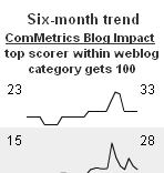
Good dashboard design enables the viewer to get the message through at-a-glance monitoring. One option is using a so-called sparkline graph (e.g., a six-month trendline across all monitored blogs). In this case, the user gets the necessary aggregate data in one glance at a single screen.
Tufte (2001, p. 171) describes sparklines as, “…data-intense, design-simple, word-size graphics.” Their whole purpose is to provide a quick sense of historical context to enrich the meaning of the measure we want to show the audience.
Infographics challenge
On principle, a graph must quickly convey complex information so we can easily understand it. Experts agree that over 80 percent of business data analysis can be done using simple graphing techniques, however the current infographics craze might lead one to conclude exactly the opposite. Namely, that 80 percent of data analysis must require complex graphing to communicate core information.
Some media have embraced this new way of presenting information:
- The Guardian: UK government spending – can you get it in one glance?
- The Guardian: Middle East protests – could a table tell it better?
The question is, can viewers see the overall shape of the data more easily and quickly with infographics than any other visual aid? Most infographics fail this acid test.
An effective infographic is a visual explanation (Dave – Communication Nation) that
a) helps you easily understand, find or do something,
b) can include words and other features in a dynamic way, if useful,
c) is self-explanatory; and,
d) reveals previously hidden or submerged insights.
Unfortunately, pretty looks may not provide answers, but raise more questions (see the New York Times’ Interactive Map: The United States of Venture Capital below).
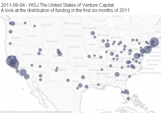
Interesting, but a bar-chart ranking the top five metropolitan statistical areas with the highest funding would have been helpful to better understand these data. As it stands, knowing which areas received how much more funding for what is difficult (e.g., healthcare versus consumer goods).
The Gates Foundation provides a more useful infographic about another important matter. But the question is, would a table added to the graphic accelerate viewers’ understanding?
Unless the infographic communicates your information better than an alternative graphic or image, why use it? Putting several circles, pie charts and others in a blog post and calling them infographics may not help either: Who Is Really Using Google Plus G+? #infographic – confusion a plenty here.
Have great example of infographics? Please add yours below.
Infographics video to the rescue – NOT
As if the the above challenges were not enough, some people tried to solve an even greater challenge by creating an infographic video clip. Unfortunately, most failed: I had to watch the video below three times to understand its core message. The constant stream of data points makes sitting through this video an eight-minute chore.

It is easy to overdo things: stringing together several data points in a video does not necessarily convey the data any better. In fact, after viewing this video I still do not understand why the War on Drugs (a term Nixon used in a 1971 speech) seems to have failed in curbing drug consumption in the US.

What great and not-so-great infographic videos have you found? Please add them to the comment section.
What can work
Unfortunately, the amount of useless, meaningless data displayed is surprising. Even things that merely illustrate data without explaining it are now called infographics, but a great infographic should enable viewers to quickly grasp the meaning and implications of a big or complex data-set.
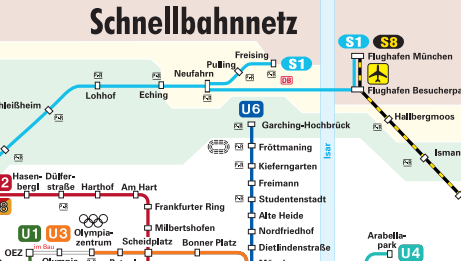
Munich’s public rail system infographic provides lots of information in a simple package (U denotes subway, S denotes rapid transit). Each route is shown in a different color, as well as each stop’s name. To avoid too much complexity, bus lines are shown on another infographic.
![]() Another example is the timeline below, comparing Blog A’s performance in 2009 with 2011, clearly emphasizing the improvement over time.
Another example is the timeline below, comparing Blog A’s performance in 2009 with 2011, clearly emphasizing the improvement over time.
PS. – Benchmark your blog – measure for impact – use My.ComMetrics.com and improve your blog’s performance.
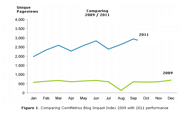
Naturally, we must also understand the context of any changes implemented to increase traffic, thereby making this information more valuable.
The graph itself will not answer a question such as, “Why did performance drop in August 2009, but increase in August 2011?” or, “What specifically explains our current performance improvement over 2009?”
Tip: To find out more about the tips and tricks we have provide on this blog about social media and more effective marketing include the words CyTRAP and ComMetrics in your search.
More important resources
- Few, S. (2006). Visual communication: Core design principles for displaying quantitative information. Retrieved August 23, 2011.
- Flowing Data (Nathan Yau’s blog)
- Eager Eyes (Robert Kosara’s blog)
- A must-read: Seminal information visualization papers (includes links to books)
- Few, S. (2011). Data visualization for human perception. In Mads Soegaard and Rikke Dam (Eds.), Encyclopedia of human-computer interaction.
- Search on Twitter for hashtag #infographic – what you think? Any great ones?
- Infographics – telling lies or… – discussion on our Facebook page
- Infographics – does it work – discussion on Google Plus
Bottom line
Always use the KISS (Keep it Simple Stupid) principle when designing graphics; visually beautifying information does not necessarily communicate it better. While a curvy Paris Hilton might get people’s attention in a busy environment (e.g., people watching TV news over dinner), she may not convey the right message, which is key to communicating with your audience.
Accordingly, losing your audience because you chose to a bar-chart does not mean they would have understood the message with a different graphic. The power of your infographics must be such that the message communicated keeps the viewer’s interest.
Just one question I hope you will answer: What is one of your favorite examples of a great graphic? I look forward to your comments below.
ComMetrics disclosure: This article contains no conflict of interest on our part; we purchased all of the books or products mentioned and were given none as samples (see FTC guidelines for disclosure).
UPDATES
Update 2011-09-20: Defining the terms. Data visualization is the graphical display of information for two purposes: to analyze (understand) our data and communicate its findings. Following from this,
– A flowchart is a graphic representation of how a a problem can be solved using a step-by-step solution.
– A decision tree is a decision support tool using a type of tree-diagram in determining the best course of action, as well as the possible consequences, including the chance of possible alternative outcomes.
Above I pointed out that an effective infographic is a visual explanation that:
a) helps you easily understand, find or do something,
b) can include words and other features in a dynamic way, if useful,
c) is self-explanatory; and,
d) reveals previously hidden or submerged insights.
Based on the above, an infographic does more than ‘just’ a flowchart or a decision tree. For instance, the flowchart can be interactive and depending upon the choices I make it shows me different outcomes. Nevertheless, building a decision tree with fancy trimmings and colors alone fails to cut the mustard as an infographic – simple may do better.
The FT ‘flowchart’ is interactive and thereby makes it easy for the viewer to see, making various choices/decisions, how the monetary problem might turn out … regarding the Euro.
I would qualify this as an infographic based on the definition I put forward above. But just a flowchart by itself is not an infograhpic. However, it is formalized graphic representation of a work or manufacturing process.
Maybe we can even suggest that successful visualization of data is information and therefore an infographic. What you think?
Pingback: Chris Isaac
Pingback: Alltop Social Media
Pingback: OwatonnaWeb
Pingback: World Economic Forum
Pingback: Urs E. Gattiker
Pingback: Naijand Inc
Pingback: World Economic Forum
Pingback: GooglePlus News
Pingback: Michael Lim
Pingback: Can infographics show you the money? | visual data | Scoop.it
Pingback: Audrey Fleury
Pingback: 1 Social Plus
Pingback: Nick Gundry
Pingback: Doug Breitbart
Pingback: CyTRAP